There’s a moment every designer knows — right before sharing a screen on a client call. The design is solid, logic is tight, but a raw Figma frame in a slide deck feels unfinished. Like serving a gourmet meal on a paper plate. For progressive web apps, where the promise is a seamless near-native experience, that gap between concept and perception can cost you the deal.
Enterprise clients think in outcomes, not pixels. Wrapping your PWA inside a photorealistic MacBook mockup helps decision-makers see the finished product before a line of code is written. That shift in perception changes conversations entirely.
Why PWA Presentations Demand More Than Screenshots
Progressive web apps live in the browser but behave like installed applications. They work offline, load instantly, and feel nothing like a typical website. Explaining that in a meeting is hard. Showing it, even in a static visual, is far more effective.
Enterprise stakeholders are rarely close to the design process. A raw screenshot reads as work-in-progress. A design framed inside a photorealistic MacBook — with natural shadows and precise reflections — reads as a finished, deployable product. The quality of your presentation directly shapes the perceived quality of your work.
Real-World Examples: MacBook Mockups in Practice
Enterprise SaaS Onboarding. A UX team redesigning an ERP onboarding flow used mockups to walk the client’s leadership through each step. Instead of explaining what a “step two confirmation screen” was, they showed it inside a MacBook frame. The client approved the flow in one session, cutting revision cycles in half.
Internal HR Portals. A consultancy presenting an employee self-service PWA used MacBook frames to tell a narrative: logging in, submitting leave, checking a payslip. Each screen felt purposeful inside a device people recognize from their own desks.
Financial Dashboards. A fintech team used angle-varied mockups to communicate information hierarchy and responsive behavior simultaneously. Visual consistency across slides made the product feel mature — reinforcing credibility at exactly the right moment in procurement review.
Retail Operations Tools. An agency pitching a warehouse management PWA used color-style mockups to reflect the client’s branding in both light and dark mode. The client saw their identity inside the product before development started. The pitch closed that day.
How to Structure a PWA Presentation with Mockups
- Open with context, not features. Lead with the user’s first touchpoint — the login screen or dashboard. Clients want to feel the experience before they examine the functionality.
- Use angle variations for rhythm. Front-facing frames for primary screens, angled views for secondary flows, and lifestyle compositions for closing slides keep the deck dynamic without custom illustration work.
- Match mockup style to the client’s world. Space grey reads as modern and technical; silver reads as clean and professional. The frame is part of the story you’re telling, whether you intend it to be or not.
- Group screens to show flow, not just pages. Two or three frames on a single slide convey movement through a user scenario. Enterprise clients think in processes — your visuals should do the same.
- Close each section with a “summary” slide. One mockup featuring the key screen with a short caption gives the audience time to absorb what they’ve seen before moving to the next block. This matters especially in long pitches where attention inevitably drifts.
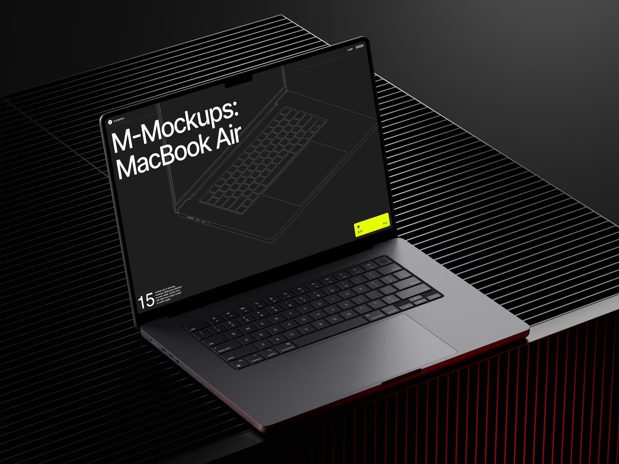
MacBook Mockups on ls.graphics
For professional client work, mockup quality reflects on your judgment. One resource that consistently clears that bar is ls.graphics.
Their MacBook collection delivers ultra-realistic rendering that holds up under projector glare and on large screens. Organized layers make screen replacement fast — no hunting through nested groups.
The collection spans many different angles: straight-on, isometric, perspective, top-down, and lifestyle scenes. Multiple color styles — silver, Space Grey, and gold. Stylish minimalistic compositions keep the visual focus squarely on your UI. The Edit Online feature lets you swap screens directly in the browser — a lifesaver when finalizing a deck the night before a pitch. And a large number of free scenes are available to try before committing, so you can evaluate quality and experiment with compositions with zero risk.
Building a Presentation System That Scales
The real efficiency gain is building a system. A master slide template, naming conventions for exports, and a folder of ready mockup frames means updates take minutes, not hours.
Enterprise clients often request live revisions. A designer who says “give me five minutes” and delivers an updated slide commands a very different room than one who promises a new deck next week. That speed is its own credibility.
Conclusion
Presenting progressive web apps to enterprise clients is as much a communication challenge as a design challenge. The gap between what lives in your design tool and what a stakeholder can intuitively grasp is where projects are approved or stalled. MacBook mockups close that gap — transforming interface work into something that looks, feels, and sells like a finished product.
Quality matters at every level of that process. ls.graphics makes it easy to bring that quality to every slide, every pitch, and every client who needs to believe in your work before they fund it.

Jane Doe, founder of CaptionBio.co.uk, crafts heartfelt messages to inspire love, gratitude, and daily positivity. Let’s spread kindness through words!